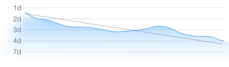

A simple chart showing you the time lapsed between panic attacks. Hopefully you can see a clear downward trend here. We tend to over estimate how prevalent our attacks are, seeing how often they actually occur can help you have a more real assessment of how often you suffer a panic attack.
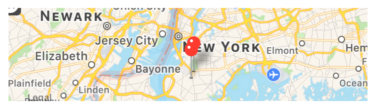
Panic attacks can start anywhere, but they may start more in some places than others. Where you are, can be a trigger, and this will let you clearly see, if certain locations trigger panic attacks. Using clustering algorithms to identify areas where you are more likely to experience a panic attack.
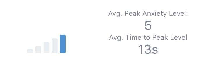
A quick glance to your anxiety level during your recorded panic attacks. The insight displays the average peak anxiety level you reach during a panic attack, and more importantly how quickly do you usually get there.
The panic attack velocity, is measured in the time it takes from the start of the recording until you reach your maximum anxiety level during the attack.
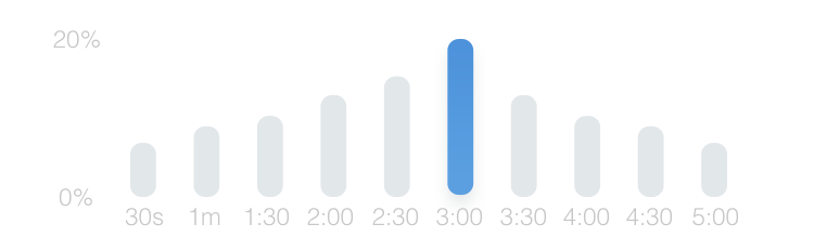
Panic attacks can lasts different amounts of time, and this chart will show you how long the your attacks usually last. You may discover that the majority if your panic attacks last roughly the same amount of time, or that you have a large variance in the length of time of an attack.
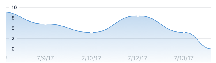
Not all panic attacks are a like, and the intensity of the attacks vary over time.
The Peak Anxiety Levels insight, charts the highest level of anxiety recorded in each attack, letting you see trends over time and hopefully see the intensity of your attack decreases over time.
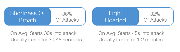
Revealing the prevalence of your symptoms, how often do they occur, when they occur during your panic attack, and how long they last, can help you be better prepared for them when they happen next time.